Showing posts with label IELTS Writing Practice. Show all posts

IELTS WRITING - Task 2 - Technology development and crime

Wednesday, February 1, 2023

Write about the following topic:
Task 2: Some people think technology development decreases crime, while others believe it actually encourages crimes. Discuss both views and give your own opinion.


Model answer:


Technology has revolutionized the way we live and interact with each other, and it has also had a significant impact on the world of crime. There are those who believe that technology development decreases crime, while others believe that it actually encourages crimes. In this essay, I will discuss both views and give my own opinion.
On one hand, those who believe that technology decreases crime argue that it provides better tools for law enforcement to monitor, track, and solve crimes. For example, the widespread use of surveillance cameras and facial recognition technology has made it easier for the police to identify and apprehend criminals. DNA analysis has also become much more sophisticated, allowing the authorities to solve crimes that would have been impossible to solve in the past. Additionally, the growth of e-commerce and the increasing reliance on the internet for financial transactions have made it easier to track illegal activities and detect fraud.
On the other hand, there are those who believe that technology encourages crimes. The anonymity and accessibility provided by the internet has made it easier for people to commit crimes such as cyberbullying, hacking, and identity theft. The availability of illegal online markets and the ease of money transfers through cryptocurrency also make it easier for people to engage in criminal activities. Furthermore, the increasing use of technology in everyday life means that there are more opportunities for criminals to steal personal information and use it for illegal purposes.
In my opinion, it is not accurate to say that technology solely decreases or increases crime. Technology is a tool that can be used for both good and bad purposes. The impact of technology on crime depends on how it is used and regulated. Effective law enforcement and responsible technology use can help decrease crime, while neglecting to address the potential criminal uses of technology can lead to an increase in crime.
In conclusion, technology has both positive and negative effects on crime. While it provides new tools for law enforcement, it also creates new opportunities for criminals. To mitigate the potential for crime, it is important for governments to regulate the use of technology and to ensure that law enforcement agencies have the resources they need to tackle new forms of crime.

READ MORE - IELTS WRITING - Task 2 - Technology development and crime

IELTS Writing - Letters

Wednesday, November 28, 2012

READ MORE - IELTS Writing - Letters

IELTS Writing - Task 1 - Bar Chart (Imprisonment in Five Countries)

Sunday, August 7, 2011

Topic:

You should spend about 20 minutes on this task.
The table below shows the figures for imprisonment in five countries between 1930 and 1980.
Write a report for a university, lecturer describing the information shown below.
You should write at least 150 words.


Model answer:


The figures for imprisonment in the five countries listed in the table are inconsistent, with no clear trend of increase or decrease.

In Great Britain, the number of individuals in prison has steadily risen from 30,000 in 1930 to 80,000 in 1980. Conversely, Australia and New Zealand saw a significant drop in their prison populations from 1930 to 1940, but have since gradually increased, except for a 30,000 decrease in New Zealand in 1980. Canada is the only country that has seen a decrease in its prison population from 1930 to 1980, with some fluctuations in the trend. The United States has the highest number of prisoners compared to the other four countries, but it is important to consider the population size when analyzing this data. The rapid increase in the prison population in the United States from 1970 to 1980 is a concerning development.

READ MORE - IELTS Writing - Task 1 - Bar Chart (Imprisonment in Five Countries)

IELTS Writing - Task 1 - Table (Consumer Durables in Britain)

Thursday, August 4, 2011

You should spend about 20 minutes on this task.
The table below shows the consumer durables (telephone, refrigerator, etc...) owned in Britain from 1972 to 1983.
Write a report for a university lecturer describing the information shown below.
You should write at least 150 words.
Consumer durables
1972
1974
1976
1978
1979
1981
1982
1983
Percentage of households with:


central heating
39
43
48
52
55
59
60
64
television
93
95
96
96
97
97
97
98
video


18
vacuum cleaner
87
89
92
92
93
94
95

refrigerator
73
81
88
91
92
93
93
94
washing machine
66
68
71
75
74
78
79
80
dishwasher


3
3
4
4
5
telephone
42
50
54
60
67
75
76
77
Model answer:


The data in the chart indicates a steady rise in the number of British households that own various consumer durables from 1972 to 1983. The most significant increase was seen in telephone ownership, going from 42% to 77% in that period. Central heating was the next in line with a rise from 37% to 64% of households having it. The possession of refrigerators increased by 21%, while the ownership of washing machines saw a 14% rise. Vacuum cleaners, televisions and dishwashers experienced a growth of 8%, 5% and 2% respectively. In 1983, the year of its inception, 18% of households had a video recorder.

These statistics showcase the profound social changes that took place during this period. The proportion of British homes with central heating went up from a third to two-thirds and the number of homes with a telephone rose from less than half to over three-quarters. These changes, along with the significant increase in ownership of washing machines and refrigerators, reflect the improvement in living standards and the trend towards a lifestyle centered on comfort and convenience.


READ MORE - IELTS Writing - Task 1 - Table (Consumer Durables in Britain)

IELTS Writing - Task 1 - Single Line Graph and Table (Annual Visits to Australia by Overseas Residents)

Wednesday, August 3, 2011

You should spend about 20 minutes on this task.
The line graph below shows the number of annual visits to Australia by overseas residents. The table below gives information on the country of origin where the visitors came from. Write a report for a university lecturer describing the information given.
You should write at least 150 words.


NUMBER OF VISITORS (million)
1975
2005
SOUTH KOREA

JAPAN

CHINA

USA

BRITAIN

EUROPE
2.9

3.2

0.3

0.4

0.9

1.1
9.1

12.0

0.8

1.1

2.9

4.5
Total
8.8
30.4
Model answer:
The given line graph illustrates information on the number of overseas visitors traveling to Australia in millions of people. Overall, one notable trend seems to be that Australia has steadily become more popular as a destination spot. For example, there were 20 million more visitors to Australia in 2005 than in 1975. That's a jump from 10 million to 30 million in 20 years.

The second table gives statistics showing the countries whose residents went to Australia between 1975 and 2005. In both years, the largest number of visitors came from Japan, followed by South Korea and Europe. Britain, the United States and China also had many people traveling to Australia in these years. In fact, the number of people visiting Australia grew in every one of these countries. For example, in 2005, 12 million people went there from Japan compared with only 3.2 million in 1975.

(147 words)

Source: http://www.ielts-exam.net/index.php?option=com_content&task=view&id=184&Itemid=32 

READ MORE - IELTS Writing - Task 1 - Single Line Graph and Table (Annual Visits to Australia by Overseas Residents)

IELTS Writing - Task 1 - Bar Graphs and Pie Chart (Enrolment in Different Colleges in the Higher Colleges of Technology)

Tuesday, August 2, 2011

You should spend about 20 minutes on this task.
The graphs show enrolment in different colleges in the Higher Colleges of Technology in 1999.
Write a total of 150 - 200 words about the information in the three graphs.
Write a report for a university lecturer describing the information given.
You should write at least 150 words.


model answer:
The charts shows student enrolment by gender and level in different colleges of the Higher Colleges of Technology colleges in the UAE.

There are clear differences in male and female enrolment. Females outnumber men in all the colleges, with almost 25% more students in Dubai Women's college than in Dubai Men's. Ras Al-Khaimah Women's College has almost 180 students, compared to only 100 in the Men's college.

Females also outnumber males by level, with almost double the number of men at Higher Diploma level (330 compared to 181). Only at Diploma level does the number of men slightly exceed that of women.

Over half the students are in Certificate level, with less than a quarter at Higher Diploma or Bachelor level.

In conclusion, most students in the Higher Colleges are enrolled at Diploma level or below, and the majority of students are women.
(143 words)
Source: Luyentienganh.com 

READ MORE - IELTS Writing - Task 1 - Bar Graphs and Pie Chart (Enrolment in Different Colleges in the Higher Colleges of Technology)

IELTS Writing - Task 1 - Double Bar Graph (Mobile Phones and Land Lines)

Monday, August 1, 2011

You should spend about 20 minutes on this task.
The chart shows the number of mobile phones and landlines per 100 people in selected countries.
Write a report for a university lecturer describing the information given.
You should write at least 150 words.
Model answer:
The graph illustrates the proportion of mobile phones and landlines among 100 people for selected countries. Generally, the majority of countries depicted have more mobile phone subscribers than landline users.

Europe boasts high mobile phone utilization, with Italy having the highest usage with 88 mobile phones per 100 individuals. Italy also has twice as many mobile phones compared to landlines (88 vs. 45). Meanwhile, mobile phone usage is lower in Canada, with fewer than 40 phones per 100 people. Denmark stands out with slightly more landlines than mobile phones.

However, some countries like the USA have more landlines than mobile phones, with 50 mobiles and 70 landlines per 100 people. Canada also follows this pattern. Denmark has the highest number of landlines, approximately 90 per 100 people, while Italy and the UK have the lowest figures for landlines.

In summary, mobile phone use appears to be more widespread in Europe compared to North America.

 
READ MORE - IELTS Writing - Task 1 - Double Bar Graph (Mobile Phones and Land Lines)

IELTS Writing - Task 1 - Double Bar Graph (World Literacy Rates)

Thursday, July 28, 2011

You should spend about 20 minutes on this task.
The chart below shows estimated world literacy rates by region and by gender for the year 2000.

Write a report for a university lecturer describing the information below.
You should write at least 150 words.


model answer:
In this report I will describe a bar chart that shows the estimated world illiteracy rates by gender and region for the year 2000.

First I will look at male illiteracy for the 6 areas shown. The lowest rates were in Developed Countries, Latin America/Caribbean and East Asia/Oceania with rates of 1% (approximately), 10% and 8% (approximately) respectively. The rates for the next three areas were much higher and quite similar to each other. Sub-Saharan Africa, the Arab States and South Asia had rates of approximately 31%, 29% and 34%.

Female illiteracy was much higher relatively in each area except Latin America/Caribbean where it was only slightly higher. The lowest rates for female illiteracy were again Developed Countries, Latin America/Caribbean and East Asia/Oceania with rates of approximately 2%, 12% and 20%. Again the rates for the next three areas were much higher and quite similar to each other. Sub-Saharan Africa, the Arab States and South Asia had rates of approximately 48%, 52% and 56%.

This ends my report.


(168 words)
Source: http://www.ielts-exam.net/index.php?option=com_content&task=view&id=193&Itemid=32
READ MORE - IELTS Writing - Task 1 - Double Bar Graph (World Literacy Rates)

IELTS Writing - Task 1 - Table (Sales at a Small Restaurant)

You should spend about 20 minutes on this task.
The table below shows the sales at a small restaurant in a downtown business district.

Summarize the information by selecting and reporting the main features, and make comparisons where relevant.
You should write at least 150 words.

Give reasons for your answer and include any relevant examples from your own knowledge or experience.
Sales: week of October 7-13
Mon.
Tues.
Wed.
Thurs.
Fri.
Sat.
Sun.
Lunch
$2,400
$2,450
$2,595
$2,375
$2,500
$1,950
$1,550
Dinner
$3,623
$3,850
$3,445
$3,800
$4,350
$2,900
$2,450
model answer:
The sales at this small restaurant during the week of October 7 to 13th followed a fairly set pattern from Monday to Friday, and then showed notable shift on the weekend. The lunch and dinner sales during the week peaked on Friday and then dipper down as the weekend set in.

During the week of October 7-14th, the lunch sales averaged at approximately $2,400. The highest lunch sales occurred on Friday, and the lowest occurred on Sunday. Sunday's lunch sales were approximately $1,000 less than the average lunch sales during the rest of the week.

Dinner sales, which generated at least $1,000 to $1,500 more a day than lunch sales, also remained steady during the week. Just like the lunch sales, the dinner sales peak on Friday and dipped down for the weekend.

Excluding Wednesday and Thursday, the lunch and dinner sales from October 7-11 rose gradually until the end of the business week. Midweek, on Wednesday and Thursday, the sales were slightly lower than they were on Tuesday.

According to the sales report, this restaurant has a steady lunch and dinner crowd. The most profitable day during the second week of October was Friday. Sunday, was the least profitable day, with the full day's sales totaling/totalling less than the Friday dinner sales. These numbers are reflective of a restaurant that is located in a business/financial district where business hours are Monday through Friday.

(234 words)
Source: http://www.ielts-exam.net/index.php?option=com_content&task=view&id=377
READ MORE - IELTS Writing - Task 1 - Table (Sales at a Small Restaurant)

IELTS Book - IELTS Preparation and Practice

Monday, July 25, 2011

Vladimir Pejovic, Michael Nicklin, Peggy Read 
"IELTS Preparation and Practice"
Oxford University Press (1999-10-08)
  ISBN 0195540948 | 160 Pages | Djvu | 8.8 Mb

A book providing comprehensive preparation for reading and writing sections of IELTS general training module. Perfect for use in the classroom and for individual study.

* The book is a part of a complete training course for students intending to sit the IELTS 

(International English Language Testing System).
* It reflects the format of the test and develops the necessary skills for reading and writing module.
* Practice tests are provided, together with step-by-step descriptions and models of how to answer test questions.
* Includes useful tips.
* Answer Key.
* The contributing authors are accredited IELTS examiners.


Wanna find good books to study? Click here to go to IELTS BOOK STORE


Leave comments below to share your favourite IELTS BOOKS to everyone.
READ MORE - IELTS Book - IELTS Preparation and Practice

IELTS Writing - Task 1 - Double Line Graph and Pie Chart (Food Budget)

Tuesday, July 19, 2011

You should spend about 20 minutes on this task.
The charts below show the percentage of their food budget the average family spent on restaurant meals in different years. The graph shows the number of meals eaten in fast food restaurants and sit-down restaurants.
You should write at least 150 words.

Give reasons for your answer and include any relevant examples from your own knowledge or experience.


Model answer:
Over the past 30 years, the average family has dramatically increased the number of meals that they eat at restaurants. The percentage of the family's food budget spent on restaurant meals steadily climbed. Just 10 percent of the food budget was spent on restaurant meals in 1970, and 15 percent in 1980. That percentage more than doubled in 1990, to 35 percent, and rose again in 2000 to 50 percent.

Where families eat their restaurant meals also changed during that 30-year period. In 1970, families ate the same number of meals at fast food and sit-down restaurants. In 1980, fam¬ilies ate slightly more frequently at sit-down restaurants. However, since 1990, fast food restaurants serve more meals to the families than do the sit-down restaurants. Most of the restaurant meals from 2000 were eaten at fast food restaurants. If this pattern continues, eventually the number of meals that families eat at fast food restaurants could double the number of meals they eat at sit-down restaurants.
(164 words)
READ MORE - IELTS Writing - Task 1 - Double Line Graph and Pie Chart (Food Budget)

IELTS Writing - Task 1 - Single Bar Graph & Pie Chart (CO2 Emissions for Different forms of Transport in the European Union)

Sunday, July 17, 2011

You should spend about 20 minutes on this task.
The table below shows CO2 emissions for different forms of transport in the European Union.

The Pie Chart shows the percentage of European Union funds being spent on different forms of transport.
You should write at least 150 words.

Give reasons for your answer and include any relevant examples from your own knowledge or experience.


Model answer:
The chart shows CO2 emissions per passenger kilometre for variuos methods of transport in the European Union while the pie chart shows European Union spending on transport. Flying by air produces by far the greatest CO2 emissions, approximately three times as much as passenger cars which are the next largest producers. Very little is spent by the EU on air travel while roads make up more than half of the EU transport budget.

Trains produce about three times less CO2 emissions per passenger kilometre than passenger cars and eight times less than air travel. Nearly a third of EU transport funds are spent on railways.

Ships are a clean form of transport and produce about the same amount of CO2 per passenger kilometre as trains do. However, only 2 percent of EU funds are spent on ports. A further one percent is spent on inland waterways.

Coaches are the cleanest form of transport. Emissions of CO2 per passenger kilometre from coaches are half those of buses. Buses emit less than half as much CO2 per passenger kilometre as cars. The European Union spends 10 percent of its transport budget on public transport, such as buses and coaches.
(197 words)
READ MORE - IELTS Writing - Task 1 - Single Bar Graph & Pie Chart (CO2 Emissions for Different forms of Transport in the European Union)

IELTS Writing - Task 1 - Map (Town of Garlsdon)

You should spend about 20 minutes on this task.

The map below is of the town of Garlsdon. A new supermarket (S) is planned for the town. The map shows two possible sites for the supermarket.
Summarise the information by selecting and reporting the main features, and make comparisons where relevant.
You should write at least 150 words.
Give reasons for your answer and include any relevant examples from your own knowledge or experience.


Model answer:
The first potential location (S1) is outside the town itself, and is sited just off the main road to the town of Hindon, lying 12 kms to the north-west. This site is in the countryside and so would be able to accommodate a lot of car parking. This would make it accessible to shoppers from both Hindon and Garlsdon who could travel by car. As it is also close to the railway line linking the who towns to Cransdon (25 km to the south-east), a potentially large number of shoppers would also be able to travel by train.

In contrast, the suggested location, S2, is right in the town centre, which would be good for local residents. Theoretically the store could be accessed by road or rail from the surrounding towns, including Bransdon, but as the central area is a no-traffic zone, cars would be unable to park and access would be difficult.

Overall, neither site is appropriate for all the towns, but for customers in Cransdon, Hindon and Garlsdon, the out-of-town site (S1) would probably offer more advantages.
(179 words)

Souce: http://www.ielts-exam.net/index.php?option=com_content&task=view&id=395&Itemid=32
READ MORE - IELTS Writing - Task 1 - Map (Town of Garlsdon)

IELTS Writing - Task 1 - Table (Families in Australia)

Wednesday, July 13, 2011

You should spend about 20 minutes on this task.
The table below shows the proportion of different categories of families living in poverty in Australia in 1999.

Summarise the information by selecting and reporting the main features, and make comparisons where relevant.
You should write at least 150 words.

Give reasons for your answer and include any relevant examples from your own knowledge or experience.

Family type
Proportion of people from each
household type living in poverty
single aged person

aged couple

single, no children

couple, no children

sole parent

couple with children

all households
6% (54,000)

4% (48,000)

19% (359,000)

7% (211,000)

21% (232,000)

12% (933,000)

11% (1,837,000)

Model answer:
The table gives a breakdown of the different type of family who were living in poverty in Australia in 1999.

On average, 11% of all households, comprising almost two million people, were in this position. However, those consisting of only one parent or a single adult had almost doubt this proportion of poor people, with 21% and 19% respectively.

Couples generally tended to be better off, with lower poverty levels for couples without children (7%) than those with children (12%). It is noticeable that for both types of household with children, a higher than average proportion were living in poverty at this time.

Older people were generally less likely to be poor, though once again the trend favoured eldery couples (only 4%) rather than single elderly people (6%).
Overall the table suggests that households of single adults and those with children were more likely to be living in poverty than those consisting of couples.

Source: Lhttp://www.ielts-exam.net/index.php?option=com_content&task=view&id=426&Itemid=32
READ MORE - IELTS Writing - Task 1 - Table (Families in Australia)

IELTS Writing - Task 1 - Single Line Graph (Wages of Somecountry)

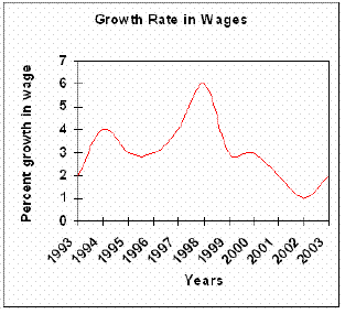
The graph below gives information on wages of Somecountry over a ten-year period. Write a report for a university tutor describing the information shown.

You should write at least 150 words.
The linegraph describes the growth of wages in Somecountry from year 1993 to year 2003.

The growth starts at two percent in 1993, but it doesn’t stay there very long before it rapidly doubles in 1994. Further on, the percentages decline to three percent in 1995, stays steady for year, before it start to rise slowly and ends up just under four percent in 1997. 1998 is the best year where the wages peaked at six percent.
However, after 1998 the wages declines nearly every year. Only a year later , the percentage drops to well under three percent, stays there on roughly three percent till 2000. In 2002 the wages reach the lowest point of just one percent growth. Luckily the growth rises in 2003 at just under two percent.
Overall, the growth rate in wages in some countries has shown striking changes through the ten years.

This is a good report. It covers the task, divided correctly into paragraphs and the vocabulary is just right. Problems: it has less than 150 words (146) and there are some grammatical errors. Assuming the corrections were made, looks like Band 7.
 
Source: Luyentienganh.com

READ MORE - IELTS Writing - Task 1 - Single Line Graph (Wages of Somecountry)

IELTS Writing - Task 1 - Table (Percentages of home schooled students in SomeCountry)

Tuesday, July 12, 2011

The table below describes percentages of home schooled students in SomeCountry in 1999-2004. Write a report for a university lecturer describing the information shown.

You should write at least 150 words.

This table shows home schooled students in Somecountry in year 1999-2004 in percentages.
Model answer:


The main trend is that all grades including kindergarten is growing every year. Kindergarten started highest at 2.4 and ended with percentage of 2.9 percent with a constant increase. But grades 1-2 and grades 5-6 show a little different trend, both started at 1,5 percent in 1999 and declines (declined) a little bit in 2000. Both of them increased slowly in 2002 and both held that course to 2004 where grades 1-2 reached 2,1 percent and grades 5-6 reached 2.6 percent.
Grades 3-4 had a slow but steady growth throughout all six years. It started at 1.6 percent in 1999 and increased by 0.1 every year except in 2003 when it peaked up at 0.2 percent. Grades 7-8 started at 1.6 percent and stays there for three years until it rapidly rised up to 2.2 and peaked at 2.5 in 2004.
Overall, all grades including kindergarten has had a rise at roughly minimum 1 percent and more in 6 years. 
This is a good report; here is how you can make it better: the coherence needs improvement, meaning the logical connection between sentences inside a paragraph and between paragraphs. Use more connective words (Furthermore, However, etc). 
The groupings you’ve done are fine, but try to use more variations describing those statistics: use words such as numbers, figures, percentages, etc. The grammar and the spelling need some extra attention

Source: 
 www.ielts-blog.com
Luyentienganh.com 

READ MORE - IELTS Writing - Task 1 - Table (Percentages of home schooled students in SomeCountry)

IELTS Writing - Task 1 - Double Line Graph (Website Traffic Comparisons)

Monday, July 4, 2011

he graph below compares the number of visits to two new music sites on the web.

Write a report for a university lecturer describing the information shown below.
You should write at least 150 words.
Model answer:
The graph shows people using new music places on the Internet in fifteen days period of time namely personal choice and trendy pop music.

The overall trend shows fluctuation with slight Increased towards the end of the period.

Starting with Music Choice websites; 40,000 poeple went on this new site on first-day. Half of them backed out the next day. In Contrast to this Pop Parade net sites were visited by 120,000 music lovers on day one which decreased slightly on the next day thereafter regaining the same fame on 3rd day.

After 3rd day the enthusiasm for both music lines on Internet dropped slowly- reaching maximum fall of 40,000 on 7th day. Whereas Music choice gained popularity, slightly Improoving to get the original strength of 30,000 viewers on screen, but was getting still less visiters than their opponent Pop group i.e. 40,000 on day 7.

In the biegining of the next week both gained remarkable recovery after a few fluctuations for 8th and 9th day having 40,000 and 50,000 visiters respectively, reaching to their peaks of one and a half thousand new viewers for Pop Parade on 11th day showing a contrast of very few people visiting Music choice for the same day. Thereafter Music choice gained popularity on 12th day for having more than 120,000 new visiters on web.

In the end of the period Pop sites were visited by maximum viewers of 180,000 whereas sites located to Music choice were not explored by more than 80,000 explorers on the last day of the report.

(257 words)
This is an answer written by a candidate who achieved a Band 6 score. Here is the examiner's comment:
Well organized with some good linking devices and collocations (gain popularity, remarkable recovery, decrease slightly) and some valid comparison of the music sites. However, some sentences are long and confusing (paragraph 5), some collocations are inaccurate (slight increased, reaching to their peaks) and there is some repetition (7th day, 3rd day, 11 th day). Some words are spelt incorrectly (poeple, Improoving, visiters, biegining).

http://www.ielts-exam.net/index.php?option=com_content&task=view&id=446&Itemid=32
READ MORE - IELTS Writing - Task 1 - Double Line Graph (Website Traffic Comparisons)

IELTS Writing - Task 2 - Globalization

You should spend about 40 minutes on this task.

Write about the following topic:
 
As mass communication and transport continue to grow, societies are becoming more and more alike leading to a phenomenon known as globalization. Some people fear that globalization will inevitably lead to the total loss of cultural identity.
To what extent do you agree or disagree with this statement?

Give reasons for your answer and include any relevant examples from your own knowledge or experience.

Write at least 250 words.
Model answer:
Globalization means that in some ways people around the world are becoming more and more similar. We often eat the same food, watch the same TV programs, listen to the same music and we wear the same clothes. Some of this at least can be blamed on the spread of multinational brands available all over the world.

On the surface, it may appear as if the global diversity of cultural identities is being lost. If, the argument goes, people in Tokyo and London look and dress the same, then that must mean that cultural differences are disappearing. However, I would argue that this is a very narrow definition of culture and that in fact cultural differences are as present as ever.


Cultural Identity is built on far more than just the films we watch or the jeans we wear. The foundation of cultural identity is shared values. When you look in detail at different cultures, you realize that the things that are important to one culture can be very different from the things valued by another culture.


Take my own culture, India, as an example and compare it to a very different culture, Japan. Although I have never visited Japan personally, I believe that it is a culture which places a lot of value on hard work and that people often work very long hours. The Indian people, in contrast, greatly value their leisure time and strive to spend as much lime with their family as they possibly can. Even if we consume the same products, I would argue that there are still some very deep-rooted differences.


To summarize, I do not accept that that total loss of cultural identity is inevitable, despite the influence of large companies and their products around the globe.
 
(294 words)
READ MORE - IELTS Writing - Task 2 - Globalization


Followers

Ielts News